Table of Contents
What is the National Debt?
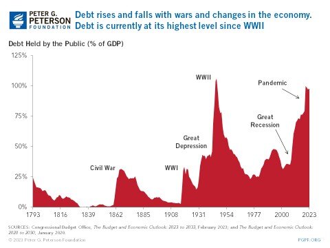
U.S National Debt Over Time
Why is the U.S in debt?
National Debt Consequences
Coronavirus and the National Debt
What will happen to our National Debt?
Solutions to reduce the National Debt
What is the National Debt?
The national debt is the debt that the federal government holds - this includes public debt, federal trust funds, and various government accounts. In simpler terms, the national debt includes both what the government owes others and owes itself. This is the total amount of deficit that the government has accumulated over the years.
The national debt today (as of May 2023) stands at more than $31.5 trillion. Here are some facts to give you an idea of how big this number really is:
- With $24.5 trillion held by the public, the government could give $73,000 per U.S. citizen.
- Since 2000, the federal debt has increased 448%.
- $24.5 trillion is about the size of the economies of China and Japan - the two largest economies in the world after the United States.
- $31.5 trillion is enough to cover a four year college degree for every American high school graduate for the next 73 years.
The national debt reached a record high at 127.7% of the nation’s annual economic output, the largest it has been since it reached 118.9% after World War II. Big events and important circumstances can prompt the government to increase spending and add to the national debt. Recent increases in the national debt can largely be attributed to the economic upheaval caused by the global COVID-19 pandemic and the legislative response to it. In March 2021, President Biden signed into law the American Rescue Plan, which will add $1.9 trillion to the federal deficit through 2031. Currently, the debt held by the public is roughly equal to the size of this year’s annual gross domestic product.
Since the national debt is the amount of debt that the government owes its creditors, it continues to grow because of the United States’ funding of programs and various sectors of the government. In 2021, the United States spent nearly half of its discretionary spending on the military, with areas such as government and education falling far behind in comparison. Mandatory spending saw most of its funding go towards Social Security, income security, and major healthcare programs. To get money to fund its programs, the government relies on tax revenue and borrowing from the public. This leads to issues when the revenue that comes in is not enough to sustain or support the programs that the government funds.
How is the National Debt Measured?
Measuring the national debt can be broken into three parts: debt held by the public, gross federal debt, and debt subject to limit.
Debt held by the public is the amount of money that the U.S. treasury borrows from external lenders through financial markets. The money gathered funds the government’s activities and programs. Many financial analysts and economists think of this portion of the debt as the most meaningful because it focuses on the money that is raised through financial markets. This portion of the debt is made up of two-thirds domestic creditors and one-third foreign creditors. By the end of fiscal year 2022, the debt held by the public was $24.3 trillion.
Gross federal debt includes the public debt and federal trust funds and other government accounts. This is the amount that the government owes other governments and itself. By the end of fiscal year 2022, the gross federal debt was $30.9 trillion ($24.3 from the debt held by the public, and $6.6 trillion for other securities held by government accounts).
Debt subject to limit is similar to gross federal debt but does not include debt issued by agencies other than the Treasury and Federal Financing Bank. At the end of fiscal year 2022, this number was $30.9 trillion.
National Debt and Budget Deficit
The federal government creates an annual budget that allocates funding towards services and programs for the country. This is made up of mandatory spending on government-funded programs, discretionary spending on areas such as defense (which makes up more than half of spending) and education, and interest on the debt. The budget deficit can be thought of as the annual difference between government spending and revenue. When the government spends more money on programs than it makes, the budget is in deficit.
The Federal Debt Ceiling
The federal debt ceiling is the legal amount of federal debt that the government can accumulate or borrow to fund its programs and pay for fees such as the national debt interest. Since its creation through the Second Liberty Bond Act in 1917, the debt ceiling has grown about 100 times. These instances have included permanent raises, temporary extensions, and revisions to what the debt limit can be defined as. When the debt ceiling isn’t raised, the federal government is unable to issue Treasury bills and must rely solely on tax revenues to pay for its programs; this has occurred 7 times since 2013.
U.S. National Debt to GDP
The gross domestic product of a country is a measurement of economic activity. This can be further defined as the value that goods and services of the United States holds. The debt of the country is how much the country has borrowed to fund its sectors and activities. Debt-to-GDP is a measure of what a country owes compared to what it produces, and is an indicator of how a country might be able to pay back its debt. If a country is able to continuously pay interest on its debt without refinancing or hampering with economic growth, it is considered stable. The higher the debt-to-GDP ratio, the more trouble a country will have paying off public debt to external lenders.
The U.S. debt-to-GDP ratio was 122% at the end of the third quarter of fiscal year 2022. This number is the U.S. national debt divided by the nominal GDP. The nominal GDP is the economic production with the current prices of goods and services considered. According to the World Bank, a debt-to-GDP ratio that exceeds 77% can slow down economic growth. Some consequences of this include lower wages, increased inflation, and higher taxes.
As of the end of 2022, the debt-to-GDP ratio was 123.4%. This large ratio can be attributed to the COVID-19 pandemic. This high ratio can be attributed to the $2.5 trillion debt taken on to provide support for businesses, government sectors, and individuals, as well as the slowed economic output due to the mandated business shutdowns around the country. Debt-to-GDP ratio has been steadily increasing long before the pandemic hit the country due to various reasons including increased spending for social programs. For example, spending for social programs as a share of federal expenses has increased from 21% in 1960 to 73% in 2021.
U.S. National Debt Over Time
National Debt by President
The National Debt has always been an area of interest for the United States; President George Washington appointed future President Alexander Hamilton to understand and solve the $80 million debt that had accrued due to the Revolutionary War. Hamilton came up with the plan to pay off the debt through taxes and the creation of the national bank. Since then the United States has steadily increased its budget deficit, and the national debt has continued to rise.
The first time that the national debt hit the $1 billion mark was in 1863 while the Civil War was occurring; it hit the $2 billion was two years later when the civil war ended in 1865. As the country went to battle during World War I and World War II, the national debt hit the $10 billion mark and $100 billion marks respectively. By 1982 after the Vietnam War and the Cold War, the national debt hit the $1 trillion mark for the first time in history. By the 21st Century, the national debt got to $20 trillion after major events such as the War on Terror and the Great Recession. Today (as of May 2023), the national debt stands at $31.5 trillion and public debt is roughly 100% of the country's GDP.
Which President Created the Most Debt?
In terms of percentages, President Franklin Delanor Roosevelt added the most debt with a 1,048% increase in national debt from his predecessor President Herbert Hoover. With $236 billion added to the national debt, President Roosevelt served as president during the time of the Great Depression which largely depleted the country’s revenue. To combat this, he set up the New Deal which included relief programs and government spending to address unemployment, severe droughts and agriculture disruptions, and bank failures. The largest part of the addition to the national debt was World War II - the war cost the country $209 billion from 1942 to 1945.
Three other presidents that contributed largely to the national debt were President Woodrow Wilson, President Roanld Reagan, and President George W. Bush. President Wilson added $21 billion to the national debt, which was a 727% increase from the previous president. Most of the money went towards paying for World War I. President Reagan had a 186% increase on the debt during his presidency. President Reagan enacted his idea of Reaganomics in response to the 1981-1982 recession and stagflation. By 1989, the federal debt stood at $2.86 trillion. President Bush added $5.85 trillion, a 101% increase, to fund the War on Terror in response to the 9/11 World Trade Center attacks. This War on Terror funded the Afghanistan War and Iraq War, and set a record high of $800 billion spent on the military.
In terms of the amount of debt added, President Barack Obama has the highest amount at $8.6 trillion. During his presidency, the United States was in the Great Recession. To combat this, he enacted an $831 billion economic stimulus package, the American Recovery and Reinvestment Act. This policy cut taxes, extended unemployment benefits, education, and healthcare spending, and allocated funds towards federal contracts, loans, and grants. In addition to this, President Obama also increased defense spending to $855 billion to fund military efforts in the Middle East. Finally, the Patient Protection and Affordable Care Act was meant to lower federal government spending on healthcare by lowering the cost of healthcare in the nation. By adding $940 billion to the federal budget it hoped to lower the national debt by factors such as lowering payments to hospitals and increasing Medicare taxes on high income households.
Why is the U.S. in Debt?
Countries around the world currently hold a national debt; in order to grow the economy and the country, debt is oftentimes needed to fund expansions and programming. The United States debt levels are extremely high, and can be attributed, in part, to income inequalities and trade deficit. These two factors indicate that some level of debt must be taken on in order to keep the economy moving. The U.S.’s national debt increased by more than 800% during the period from 1989 to 2022.
Why is the Debt So High?
As of May 2023, the U.S.’s national debt stands at $31.5 trillion. Factors that contribute to the U.S.’s high national debt include continued federal budget deficits, the government borrowing from the Social Security Trust Fund, the steady Treasury lending from other countries, low interest rates that promote increased investment, and raised debt ceilings.
Other factors that contribute to the high national debt include the inefficient healthcare system and the changing demographics of the country. Though the U.S. spends more than other countries on healthcare, health outcomes are not much better. In addition, the Baby Boomer generation are now becoming elders and seeking benefits and increased healthcare services. The government will spend, sometimes inefficiently, more on programs and services for the longer living older generations.
Can the U.S. Pay Off its Debt?
As budget deficits are one of the factors that contribute to the national debt, the U.S. can take measures to pay off its debt through budget surpluses. The last time that the U.S. held a budget surplus was in 2001. Much of the world depends on U.S. bonds to fund their own countries, and it has become a way of life for governments around the world. While it is unlikely that the U.S. will stop doing this, measures can be taken in other areas to decrease the national debt.
National Debt Consequences
A positive, strong fiscal outlook is an important aspect of a successful, growing economy. Without this, a nation is subject to negative outcomes that can affect the wellbeing and future of its citizens. Some of these factors include decreased savings and income, higher interest costs, and lack of flexibility. It is apparent that fiscal policy matters, and there is a need to act.
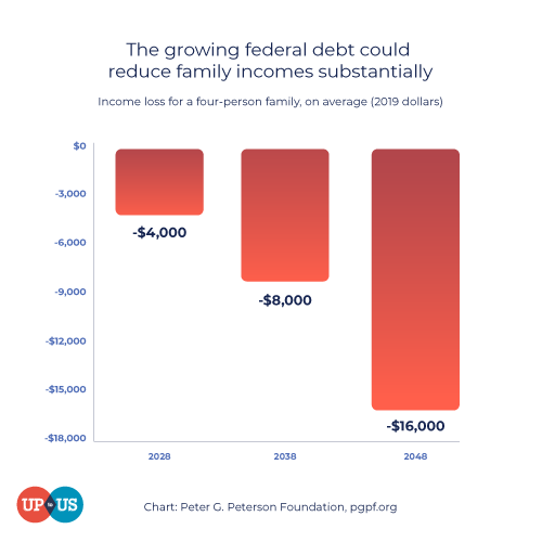
Since national debt is at such a large level, it may seem far removed from our everyday lives. National debt, however, does have the ability to affect individuals. One way that it can do that is through the growth of income. The rising debt could reduce income per person by 4.4% in 2052. This is because lower investment slows down income growth, and that crowding out will occur as the U.S. looks to borrow more money.
How does the National Debt Affect Me?
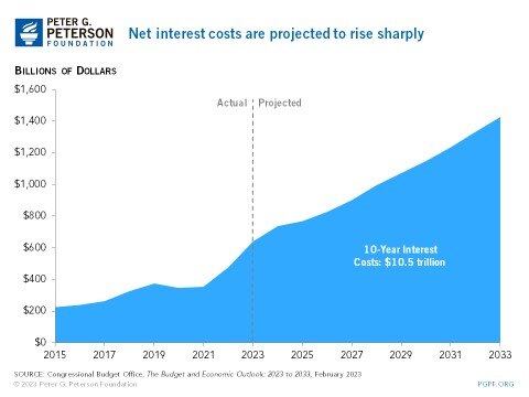
Interest payments also have an important role as they grow in step with the national debt. As the government allocates more funds towards paying off interests, other investment areas could get crowded out. Areas such as education, research and development, and infrastructure may not progress at sufficient or adequate levels due to interest payments. Interest payments currently take many of the dollars that are raised through federal income, estate, and federal excise taxes.
Net worth is also an important and interesting factor that can be affected by the national debt. The cost of borrowing money to purchase large assets such as homes will increase due to the Federal Reserve’s interest rates. Interest rates will push down the prices of homes as individuals will struggle to qualify for mortgage loans; this will then lower prices on home values.
How Much Do Other Countries Owe the U.S.?
Public debt makes up three-quarters of the national debt, and foreign governments and investors make up one-third of public debt. As of January 2023, the countries that own the most U.S. debt are Japan, China, the United Kingdom, Belgium, and Luxembourg.
Though China had been the long-standing top placeholder for the country with the most debt owed to the United States, Japan currently holds $1.1 trillion worth of U.S. debt. The second place holder, China, currently holds $856 billion in Treasury holdings. Together, they hold 26% of all foreign-owned U.S. debt.
Coronavirus and the National Debt

The U.S. government has taken efforts to offset the effects of worldwide health pandemic by borrowing money to invest in individuals, businesses, and state and local governments. Of these responses, the CARES Act has been the largest stimulus package in U.S. history. This stimulus package included $2.3 trillion towards relief for large corporations, small businesses, individuals, state and local governments, public health, and education. In order to pay for the relief fund, the government needed to expand its debt; to do so, the government borrowed money from investors through the sales of U.S. government bonds.
What Will Happen to Our National Debt?
U.S. spending is currently at an all-time high to combat the effects of COVID-19. The current level of debt-to-GDP is comparable to the period immediately after World War II. Despite the effort to reduce the national debt, it is apparent and crucial for the government to take on the debt during times of crisis. Being able to adequately and successfully respond to emergencies is one of the many reasons why the national debt should be reduced; governments should respond to events in an appropriate and timely manner with its citizens in thought.
Solutions to Reduce the National Debt
76% of voters believe that the President and Congress should allocate more time and energy towards addressing the national debt. Americans care about the national debt, and some work has been done in order to address this issue. Solutions include raising revenue (which in turn raises taxes), cutting spending, and growing the country’s GDP.
Policy options such as the Simpson-Bowles plan (which included measures such as raising revenue, reducing spending, putting caps on defense and nondefense discretionary spending, and reducing tax rates) and the Domenici-Rivlin Task Force (which included raising revenues, reducing spending, freezing domestic discretionary and defense spending, and putting Social Security on a sustainable path) have made efforts to create plans to reduce the national debt. Centers and institutes such as the American Enterprise Institute, Bipartisan Policy Center, Center for American Progress, and Economic Policy Institute all proposed things ranging from slow growth to reduction in benefits for high-income individuals.
Young people across America are getting educated about fiscal policy and making changes at their colleges and universities with Up to Us.
Sign the pledge to let local representatives know that you are concerned about the nation’s fiscal future, or get involved by learning about how you can make a difference in your own community.